Background
Versavo, by Dr. Reddy’s Laboratories Limited (DRL) is a biosimilar product of the oncological innovation Bevacizumab. Dr. Reddy’s tasked us to create the branding identity and website of Versavo.
Strategy
In India, like in most countries, the promotion and advertising of prescription medicines are heavily regulated. Laws prohibit the promotion of prescription drugs directly to consumers. Since this limits the advertising possibilities, we saw that the identity itself could, if extended create a visual imprint inside the very constricted opportunities-to-see that such drugs have.
At the broadest level, the strategy seeks salience: to make the brand visible beyond its core audience. Though it’s marketed to relevant oncologists, seminars, events, literature are also touchpoints. Referring doctors and sales reps are also opportunities to insert the story.
We reasoned that in a cancer patients journey, primary care doctors, gynaecologists and other specialists— were likely to be the initial referring doctors, and enjoy the patients’ trust. They would like to be informed of the drug and how it worked. Patients tend to stay in touch even after consulting the oncologist.
To do this, the logo was given a memory hook, a talking point. It stems from Versavo’s mechanism of action, it would serve as an effective mnemonic not only for doctors but also for sales reps, effectively increasing the visibility of the brand. Likewise, the logo could give sales reps an effective quick, way to be reminded— and remind their targets— of how the drug worked. Its visual extension would then create the rest of the recall.
Design
Versavo is effective against 7 types of cancer. It targets inhibits VEGF, a protein that causes blood vessels to grow and feed the tumor. Blocking it blocks angiogenesis (the formation of blood vessels) a resists the tumor’s growth.
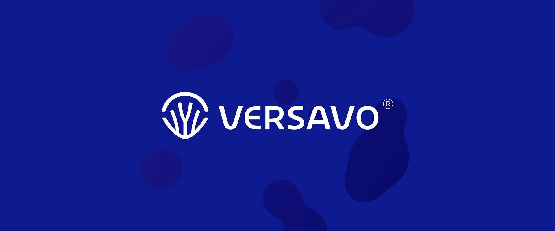
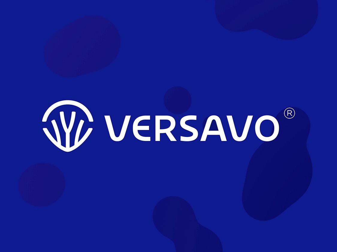
Our identity illiustrates ‘anti vascularization (inhibiting growth of blood vessels) mechanism of action. Using the V shape that contains the vessels (for Versavo, versatility and vascularisation) reinforces the memory structure. The colour spectrum arc on the top of the logo hints at the wide spectrum of cancer conditions the drug tackles, and is seen to cap the growth of vessels.
The gradient arc can also be extended across various graphic elements as a branding mark, further enhancing the visibility and aiding brand recall.
V for Versavo, versatility and vascularisation
Versavo, by Dr. Reddy’s Laboratories Limited (DRL) is a biosimilar product of the oncological innovation Bevacizumab. Dr. Reddy’s tasked us to create the branding identity and website of Versavo.


identity stems from Versavo’s mechanism of action
Using the V shape that contains the vessels reinforces the drug’s mechanism of action. It inhibits VEGF, a protein that causes blood vessels to grow and feed the tumour. The colour spectrum arc on the top of the logo hints at the wide spectrum of cancer conditions the drug tackles (7 cancers) and is seen to cap the growth of vessels.

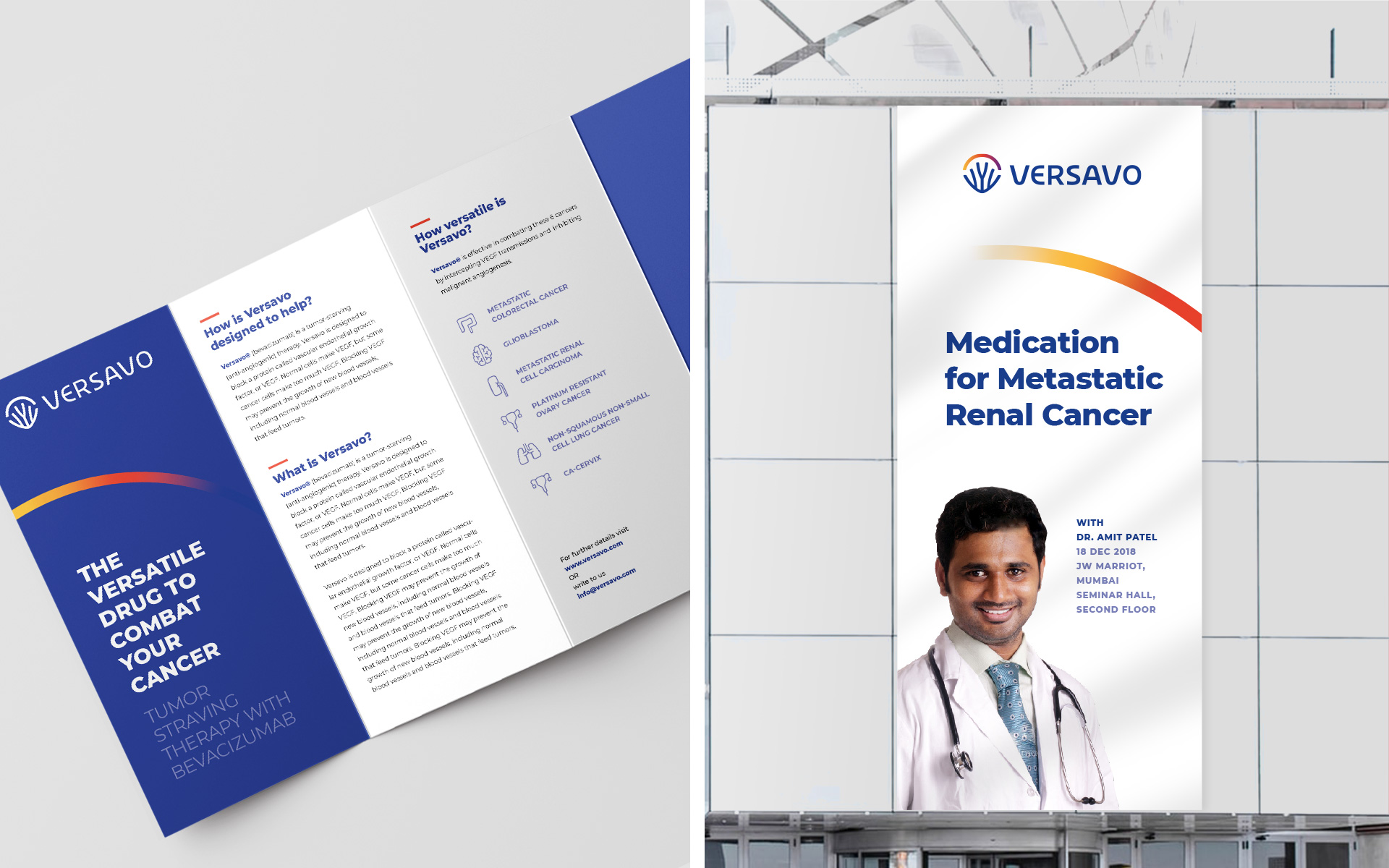
the logo presents a memory hook and drives salience
An effective way to be reminded of how the drug worked—to doctors, and sales rep at various touchpoints like seminars, events, literature. The gradient arc can also be extended across various graphic elements as a branding mark, further enhancing the visibility and aiding brand recall. Visit www.versavo.in
partner-in-charge itu chaudhuri | creative director richa bhargava | design concept aadarsh rajan | design development aadarsh rajan, archie parikh | project duration 3 months