Brief
The established news house Rajasthan Patrika owns a slew of print, television, radio and digital properties in Hindi. It enjoys a loyal legacy of regular readers in print. The next digital generation respects this legacy, but needs something more to connect with it. As the Indian language news market heats up on digital, the urgency to connect, engage with young news consumers is greater than ever.
Now in expansion mode, Rajasthan Patrika plans to go countrywide and be available in other regional languages in the digital space. These changes called for a new identity—shedding the ‘Rajasthan’ prefix to become more national and an effort to connect with the next-gen digital reader. It needed a symbol that could enable a unification of the group’s offering to the readers, viewers, listeners of news in the 21st century.
Approach and Strategy
Reader conversations revealed a reputation for reliability and plain speaking. We recognised the need to appeal to an increasingly cosmopolitan and bilingual audience. Yet, as a category, Indian language publications do not enjoy a uniform image of quality, making it a potential barrier to growth. Patrika’s identity needed a modern voice, while projecting its authenticity, courage and reliability. A multi-language brand extension was also important that this juncture.
Design
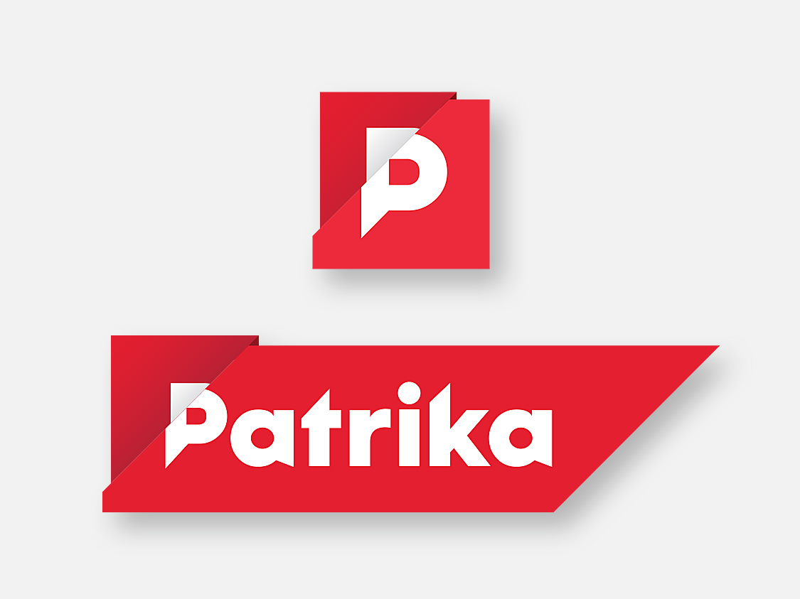
The new identity projects Patrika’s fearlessness, courage speed and confidence, in a younger voice.
The letter P fits effortlessly with the main targets. Hindi readers who are not literate in English are familiar with English characters, and many of Patrika’s readers read English publications as well.
The diagonal breaks in the housing and in the lettering terminals evoke Patrika’s sharp and intrepid spirit, flying a flag for independent journalism. Simultaneously it hints at its Hindi heritage.
The identity was lettered in a lineal style, facilitating conversion into other regional scripts without loss of character. A range of applications from the TV signature, the newspaper masthead, Twitter icon, video signatures to the digital app icon were delivered as parts of the whole system. Even the digital app icon carries the brand as effectively as the whole identity does. It works seamlessly from 80 pixels 80 feet in size, preserving its character across all mediums.
With an identity that is not traditional but modern and even a touch daring, the base is laid for products and services that can confidently extend Patrika’s relevance to this generation of digital readers.
Wondering if a regional publication can become a nation-wide fame? Rajasthan Patrika shows how
Rajasthan Patrika boasts of a slew of print, television, radio and digital properties in Hindi, and enjoys a loyal readership in print. Millennials, however, need something to bridge the gap. Keeping in sync with the needs of this tech-driven generation, Rajasthan Patrika is now shooting for a greater visibility in the digital space. This called for a new identity—shedding the ‘Rajasthan’ prefix to connect better with the next-gen digital reader.


We decoded the need of the hour, a multi-language brand extension
After engaging in reader conversations, we decoded the need to appeal to an increasingly cosmopolitan and bilingual audience. Yet, as a category, Indian language publications do not enjoy a uniform image of quality, making it a potential barrier to growth. Patrika’s identity needed a modern voice, while projecting its authenticity, courage and reliability. A multi-language brand extension was also crucial at this juncture.


Courage, speed and confidence in a younger voice. From 80 pixel to 80 feet and everything in between
The new identity reveals Patrika’s fearlessness, courage, speed and confidence, in a younger voice. The diagonal breaks in the housing and in the lettering terminals evoke Patrika’s sharp and intrepid spirit, flying a flag for independent journalism. Simultaneously it hints at its Hindi heritage. With an identity that is not traditional but modern and even a touch daring, the base is laid for products and services that can confidently extend Patrika’s relevance to this generation of digital readers. A range of applications from the TV signature, the newspaper masthead, Twitter icon, video signatures to the digital app icon were delivered as part of the whole system.


Partner-in-charge & Creative Director Lisa Rath | Design Concept Kshitj Tembe | Design Development Jasvinder Singh | Alternate Design Concepts Palash Jain, Niloy Kundu, Archie Pareek, Aashim Raj | Project Duration 2 months